04/05/2012

Evaluation

In what ways does your media product use, develop or challenge forms and conventions of real media products?
For my print tasks to be suitable for my target audience I had to interpret some conventions from other real music promotion packages into my own, so that I could effectively attract my target audience. Below is the link to a Prezi presentation I created discussing my print tasks and it's conventions:


My video challenges typical conventions of a music video as it is very different to generic texts. Regarding theorists and their theories, my music video doesn't fit into any of them as it doesn't have a storyline, has only one character and has no disequilibrium - it has no hidden meanings or semiotics, it just is, a video to show the lyrics in a peculiar, original way. It is not a typical video where you follow a character along and there is a theme, such as romance, or parties or something alike, it also doesn't have some big dramatic or suspenseful ending like most videos seem to include. It is similar to my inspirational texts however it totally stands on it's own independent of those and interprets the ideas in it's own way. 


How effective is the combination of your main product and ancillary texts?
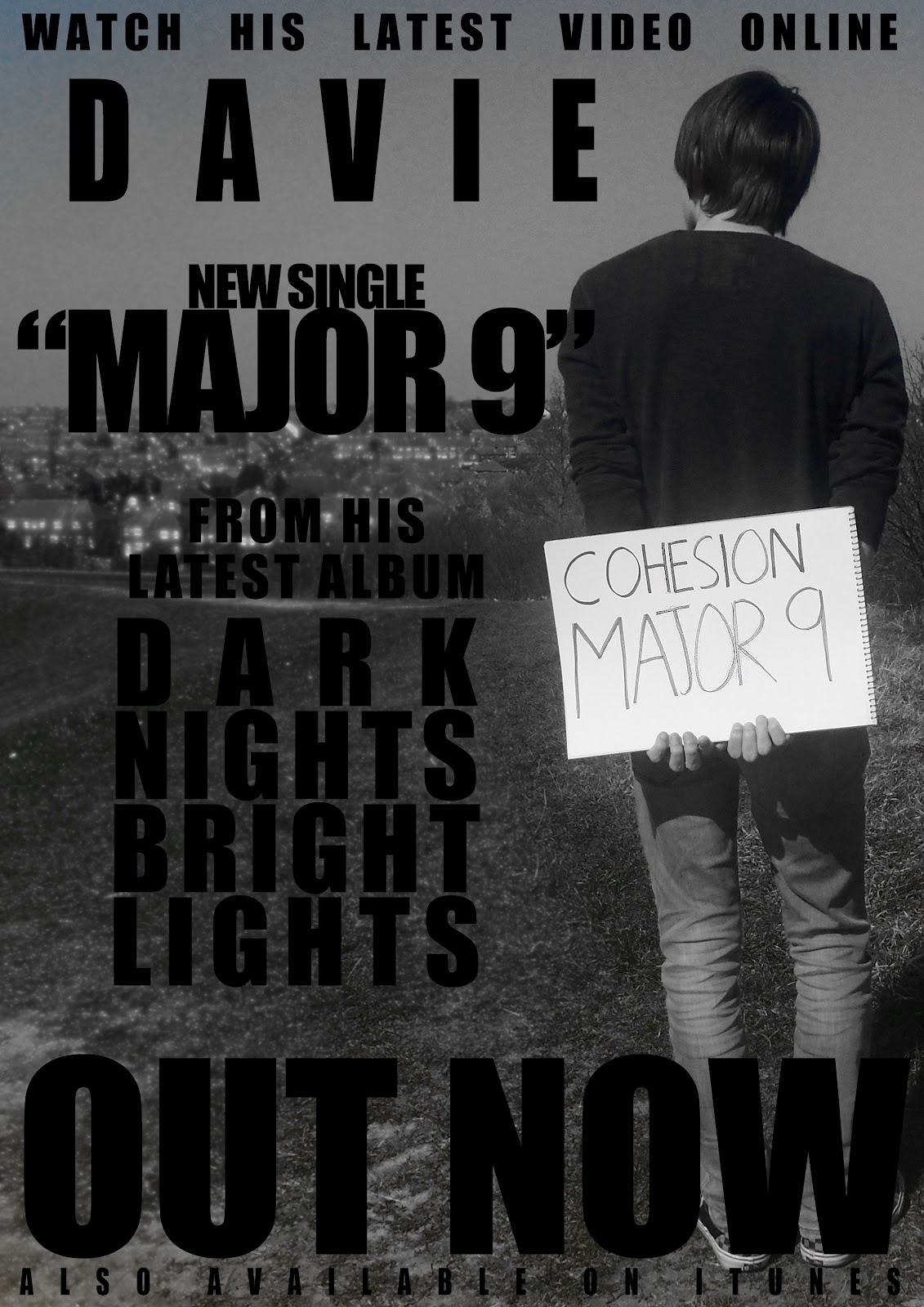
Both my video and print tasks were synonymous and in a sense were connotations of each other. My video was located in a spacious open place with hills, fields and a lot of the North East in the background, and was nice to look at which gave a positive and calm feel to the video. My print tasks match up with this as the setting is maintained and consistent, the images presented in my print tasks were took in the same location as my video so as to not complicate things as I wanted to take a simplistic approach to my project. I feel that the one location has linked the products together so that if the target audience were to see them they would match them up, which creates a professional feel to the promotion package. Both the video and print tasks also contain the same character so that a connection can be made and the audience isn't confused, which is a rather conventional trait to have.


What have you learned from your audience feedback?
For audience feeback I used several different methods which has allowed me to gain various different types of constructive criticism. To ensure that my magazine would appeal to my target audience I carried out some research on their lifestyle and what they are interested in so that my magazine would be suitable for them, so the first thing I created was a basic online questionnaire on google docs to get a general outlook of who my target audience would be, which was filled in by teenagers aged 15-20. This questionnaire consisted of five different questions to find out what my audience were interested in doing, what their preferred genre of music was and what their lifestyle situation was like etc. My questionnaire and a sample of results are summarised below:


Summary of a sample of results:


My target audience was mainly working class with all of the participants being in education with some also being in work, or even both. The dominant response for what people are interested in was that they like socialising and going out with friends and the genre of music that occurred most often was indie and pop, so I know I need to create my product aimed towards these people. 
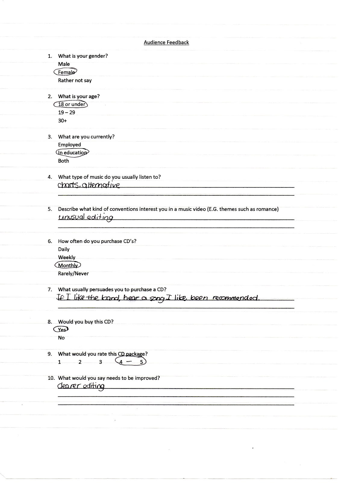
I then created a written questionnaire which could be distributed to a wider range of people and included questions related to my print tasks so that I gained knowledge of what people like about it and what they would change. Below is a sample of questionnaires that were completed and what answers I received:


After this I downloaded the Google chrome extension 'Reel' which allows you to upload images and videos so people can either give them a thumbs up or a thumbs down depending on what they think of what they're looking at. I uploaded my print tasks and shared the link so my peers could rate my product. Below is the embedded 'Preso' and the report of what my print tasks have been rated so far.


The results of my poll show that all my print work was well received except for the inside cover of my album which received five negatives and only one positive. Gaining this feedback let me know that I needed to somehow improve my product, therefore I went into Photoshop and added the same effect I have on the front and back pages meaning it was consistent and matching in turn making it look more professional. Apart from this the rest of my print tasks gained positive feedback (each getting a minimum of five thumbs up and a maximum of one thumbs down). Altogether, there were 22 votes up compared to 7 votes down, showing most of my work was of a good standard.


How did you use new media technologies in the construction and research, planning and evaluation stages?
Involving research and planning, new media technologies helped a great deal for instance search engines and websites such as Google and Youtube were used to find inspirational texts to help me form ideas and plans of what I wanted to do for my own promotion package. If it was not for the internet and these sources were not available for me to search then older methods such as actual print photographs and music magazines would have had to act as a resource for me to gain inspiration and ideas to help me along, which would have been more time consuming and harder to present in one place. Google also assisted me by having the Google Docs option, which let me create a questionnaire so I could gain audience feedback. Another media technology which was extremely helpful was Blogger. This was good to have access to as it allowed me to present and show all my ideas on the only blog, which I could update at any time in any place which had an internet connection which meant my research and planning was constantly ongoing and changed over time, helping to show development of my products and how I progressed during the time I spent on my planning. This is progressive from my AS coursework as it was all paper based and could get confusing and hard to change things and update pieces that were incorrect - the online blog made it easier to alter and change particular information.
For the construction of my work, the two programmes Photoshop and Premier Pro were a massive help, as they are very advanced and helped create an efficient end product. The had various different tools which allowed me to alter, add, deplete and create complex pieces of work to come out with the best end result I possibly could. I was more advanced this year with the programmes that were being used as I had a better understanding of how to use them to get the best effective piece of work. 
I also used a website called 'Prezi' for my evaluation which allowed me to create a presentation of images and text in a more unique and up to date way rather than using powerpoint or just having mass amounts of text. It was more creative and interesting and made my evaluation more interactive for people when accessing it. The final media technology I used for my evaluation, was the Google Chrome extension 'Reel', which allowed me to upload my print tasks and let people rate them positively or negatively, which was a simple, easy yet interesting way to get feedback from peers and my audience which meant I knew what I was doing right but then also what I could improve.


02/04/2012

Final product - music video

Below is the finished version of my music video which I have created as part of a promotion package including a CD cover and an advertisment.


When editing my video I did insert a 'lens distortion' effect which changed the look of the video slightly. When I exported the video however, the effect cannot be seen when the video plays changing how I wanted it to look which could affect how the video is perceived and rated.

Tools used

One of the main programmes I used to create and edit my print tasks was Photoshop CS4. It has all the tools and editing options needed to create a professional looking CD cover and advert which will help me achieve the high grade I want. The main tools that I used in this programme were the eraser tool, the blur tool and the desaturate tool which ensured I gained just the right look I wanted for my product. I also used the box shown to help me alter text I used to get it the way I wanted it.


The programme I used to create and edit my music video was Adobe Premier Pro.It allowed the editing to be easy and simple to understand, with effects being able to be added effortlessly. Cutting my clips was easy as the process wasn't complicated. I was able to put together my clips quickly yet in a professional looking way as the software allowed me to add transitions and video effects, the main ones I used being 'lens distortion' and 'ghosting' as my footage was all handheld so these two effects added a more professional look to my video instead of the shaky shots. Finally, it allowed me to add the track I wanted to use over the top of my video quickly and efficiently, as I just needed to drag it over and then place my clips at the right position.

Storyboards, types of shot and pose

The type of shot I will mainly include in my video is a long shot, so that the person I am using can be fully seen and is entirely in the frame, with the background behind him also in view. He will be in one consistent pose, not moving except to change over the boards with the lyrics on them. The boards will have the words handwritten onto them so won't be any specific font and will mainly be in black with only hints of red and blue added throughout.


Print tasks - advert


I created two examples of adverts for my promotion package both of which I have included as I couldn't decide between the two. I have interpreted two similar images into each, one featuring the album cover I made and the other showing an image of my main character advertising the single which I made a music video to. Both posters include the same fonts and say the same things, however are set out in different layouts. The font I used was 'Impact' with various sizes depending on what piece of text it was.
I feel like whilst the first advert is very plain and has a lot of white space, it is keeping with the tone of the simple theme I was aiming for, therefore making my promotion package look overall more professional. My second advert contrasts the first however as the image takes up the entire background with the text over lapping it making it more busy yet not overcrowded and still having an effect whilst maintaining a sophisticated quality to it.

01/04/2012

Print tasks - CD package

This is the final front cover for my print task of a CD package. Since the person I am using in my music video has changed I also used the same person in my print tasks so that my work was consistent and looked professional. I took an image of him holding up a big piece of card which I would insert the album title onto with the artist's name. I blurred the background behind him and then desaturated the image to drain out all the colour and make it more black and white/greyscale so the theme of my promo package is in keeping with each other.
This is the final back cover for my print task of a CD package. My first draft had an all white background with no image or detail, but I have incorporated images of trees underneath the diamond shape containing the song titles on the album to match the front cover which has a scenic landscape behind my main character.
This is the final insert for my print task of a CD package. I took several images of my main character in different poses and positions, which I then inserted into photoshop to edit into one image to look like the same person in one place several times. I erased around four of the separate images and places them onto the fifth image which still had it's background. I then blurred the background behind each image and desaturated the colour out of the entire image so that it matched the rest of the CD package.

Time management

My time management last year wasn't as successful as I had hoped, as the person I chose to be the main character in my video was unreliable as he was hard to get in touch with and arrange things. Because of this I have decided to revisit my time management and revise it so that everything is completed in time as I have changed certain elements, such as the person I am using. This is the dates I have allocated to each task:

FEBRUARY
6th - 10th: storyboards, recces, characters and shot types
11th - 12th: audience research
13th - 16th: filming video and getting images
17th - 19th: organising materials
20th - 24th: editing of video and altering print tasks
27th - 29th: additional audience research

MARCH
1st - 4th: feedback of work and improvements
9th - 11th: improvements
12th - 16th: any unfinished work
19th - 23rd: evaluation
30th: final deadline

30/03/2012

Original images

These are some original images that I took which will be used for my print tasks - my front cover of the album, the inserts and my poster that I will create. The images are clear and easy to see, and relate to my actual video idea of holding up signs and lyrics, therefore being consistent and thorough with what my initial plans were. It is keeping with the tone and in either the same or a very similar location.


Actors, location and props used in my music video

I have used David Wright as my main actor in my music video, as I feel that he has the right look to match the genre of the song I am using, which is also helpful as the song is by the band he is in, which made it more convenient to include him in my work.


 The location I have decided to use is Silksworth on top of one of the hills, so that there is a scenic background which will make the video look nicer and less boring instead of just having my actor stand infront of a plain white backdrop, for example. I have chosen to do this as I felt that a plain background would have ben too simple, and would have made my idea look dull and boring, however this way this location means there is lots going on behind my actor which will contrast with the simplicity of what he will be doing.


There will only be one main prop which I will use in my video and that is an A3 notepad which will have the lyrics to the song written on, which my actor will flip as the song plays through. I thought it would make my video different however simple it is to use, as it isn't conventional or typical of a music video.

04/12/2011

Flat plan for advert


Colour: The colours will be a simple black and white - all text will be black, and the image of the album cover will be plain and simple, as the image on it will be in black and white. I have chosen this colour scheme as I like how effective the simple colours are together and how they look quite professional.
Image: there will be one main image on this page and that will be the album cover of the artist. It will fill a lot of the page and will be in black and white. I will include this so my advert looks more interesting and has more elements, and so that the audience can link the text to an image. Apart from this there will only be a few little thumbnail sized images which will be the logos of iTunes and the company that produced the album.
Text, layout and font: All the text will be in Impact or something alike. The sizes will vary but the font and colour will be consistent. The layout will be set out in quite a simple way as the information will just read down the page. I have chosen to do this as I believe it will look simple yet interesting, and will overall look very proficient.