04/12/2011

Flat plan for advert


Colour: The colours will be a simple black and white - all text will be black, and the image of the album cover will be plain and simple, as the image on it will be in black and white. I have chosen this colour scheme as I like how effective the simple colours are together and how they look quite professional.
Image: there will be one main image on this page and that will be the album cover of the artist. It will fill a lot of the page and will be in black and white. I will include this so my advert looks more interesting and has more elements, and so that the audience can link the text to an image. Apart from this there will only be a few little thumbnail sized images which will be the logos of iTunes and the company that produced the album.
Text, layout and font: All the text will be in Impact or something alike. The sizes will vary but the font and colour will be consistent. The layout will be set out in quite a simple way as the information will just read down the page. I have chosen to do this as I believe it will look simple yet interesting, and will overall look very proficient. 

21/11/2011

First draft of print task


These two images are the first drafts of my front and back cover of my print task. I am quite happy with the way it has turned out but they both still need improvements.
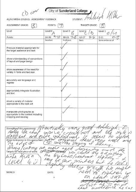
Over the half term I received feedback off my lecturer which I will take into account and change my work where it is necessary:


17/10/2011

Target audience

The target audience for my promotion package won't be a very wide audience. My promotion package will be aimed at people around the age of 15 to 25 and mainly male, however that isn't to say that females wouldn't like the music. It would most likely attract students, who are in college or late school, who have had a good education. Their interests would be things such as playing music, attending music events and they'd spend their money on albums relating to the genre, as well as musical instruments and things related if they are a musician themselves. They'd often attend gigs where bands related to this genre would play and would go to festivals. They'd be of social grade B to C1/C2 and would live in quite nice accommodation.

Flat plans for print task


This is the flat plan for the back of my album cover.
Colour: the colours I have picked are black and white, as I like how the two colours contrast. I also like the simplicity of just having two simple colours. It's minimun detail yet stull very effective. The background will be white with the diamond being black. This will fit in with the front cover.
Text: the only text on this side will be the song titles within the diamond, as well as the copyright details along the bottom.
Layout and Font: the font used will be simple and readable. It will be white so it stands out against the black and goes with the theme. It will be something neat and clear, like Arial for example. The text will be fitted withing the diamond. The layout will be simple - the diamond will be placed in the centre of the page.


This is the flat plan for the front of my album cover. 
Colour: the colours I have picked are black and white because of the way they contrast. As well as this the two colours are very simple, but they go together and are very effective. The image will be in black and white with the background being plain white and the board either being a blackboard or a whiteboard.
Image: the only image I will use on this cover will be of the main person starring in my video, holding up a board with the name of the album and possibly the artist's name. It will be a full body medium long shot and will be head on to the person. The person's facial expression won't be a strong emotion, but will be a neutral kind of expression. They will be making eye contanct with the camera and they won't have any particular stance, they will just be plainly standing.
Text: the text will be on the board and will relate to the image.
Layout and Font: the font will be the opposite colour of the board, and the writing on the board will be hand written.
This is the flat plan for what the CD would look like.
Colour: again, the background will be white to stay consistent, although the disc that would go here would be black to continue with the contrast which is the theme of the CD package. 
Text: text will be on the disc - the artist and album title.
Layout and Font: the font will be the same font used on the outer casing pages and this will be positioned around the bottom right of the disc. It will be low key and, once again, simple and easy on the eyes.


This is the flat plan for the inside of the album case.
Colour: the background behind the images will be white, while the images will be in colour to avoid the promotion pack becoming too repetitive, although this may change depending on what colour scheme looks best.
Image: there will be around five images per side on the inside of the album case, and these will all be medium long shots of the person I will be using. Each image will consist of a different pose and/or facial expression as I think that this would make my album art more interesting and fun to look at.
Text: there will be no text on here as I think just having the images will be more effective.
Layout and Font: the layout will be basic - the images will be spread across the two sides on the inside case and will fill the majority of the pages. Although it doesn't seem simple it will hopefully portray this way to the audience.  

Overall, I hope to make my album art look professional and of a high standard.

13/10/2011

Inspiration texts for my magazine advert


This is a magazine advertisement for the band Mona. It fits in well with my research and ideas as it is a black and white image, accompanied by a black font. It is more targeted towards a male audience as the background images are very masculine and not something a girl would usually be attracted to. My promotion package is targeted at both genders but the fact the character I will be using is male and the colour scheme will be mainly black and white it could be said to me more of a male promo package.
Black and white is more of a tame, 'chilled out' vibe in comparison to bright, vibrant colours which give the effect of irregular, exciting music.

Song choice


This is the demo for 'Major 9' by Cohesion; this will be the band that I use for my main video task. This song is one of my main choices for my video and I will be using one of the members of the band as the main character in my promotion package. I have chose this song because I enjoy listening to the song, and because of that it makes me feel more motivated to create a good music video to accompany it. I particularly like the introduction to the song as it is unique and and interesting. It is also the right type of genre for my ideas and plans, and it is a song that my target audience will enjoy.

10/10/2011

Inspirational text for my album cover


This is the album cover of Olly Murs' album. I have included this as it is like some ideas I have about my own album cover. I like how the images on the cover are black and white - this is the main idea I have for my front cover image. As well as this the image of the artist is repeated, but in six different ways. I think this is an interesting idea and makes the album cover more unusual than just one plain image. I would like to interpret this idea into the inside of my album cover as I don't want to just leave the inside blank. I think it will make my promotion album look more professional and more interesting overall.
Also, I like the artist's name, how it is the only thing in colour making in stand out. It contrasts with the image and completes an overall very nice album cover.

Time management


This is an image of a planner which I used to manage my time and plan out what tasks I am going to carry out and when.
The image hasn't photographed very well and the months have been cut off so I have listed the dates and what will be done during that time period:

September:
12th - 28th research and planning
29th - 30th inspirations for print task

October:
1st - 2nd inspirations for print task
3rd - 7th flat plans for print task
8th - 12th song choice and characters
13th - 16th examples and drafts of main print task
17th - 19th finished product so far and audience research
20th FIRST DRAFT
22nd - 28th shot types and images of location etc.
29th - 31st storyboards

November:
1st - 2nd storyboards
3rd - 6th recce's
7th - 13th examples of filming and additional research and planning
14th - 16th complete changes and film task
17th CHANGES
21st - 25th any changes to any of the tasks

December:
5th - 8th final touches
8th COURSEWORK
9th FINAL DEADLINE

04/10/2011

Inspirational texts for my album cover and advertisement


This is an advertisement for You Me At Six's album "Sinners Never Sleep". I have included this as it is similar to the kind of idea I had for my own album cover, and the black and white also relates to what I was thinking of. I like how someone is holding a sign, and that it shows what the album and band are called. It's also a good advertisement as it isn't too crowded; it just shows the album alongside the track list, with the release date underneath - it is simple yet gets the message across.


This is an advertisement for Paramore's single "Ignorance". Again, it's a black and white advert which I hope to adapt into my own work, and there are minimal elements as well as only two different fonts which helps keep it basic. It isn't overcrowded or cluttered which also makes it look more professional. 

03/10/2011

Inspirational texts for my music video


"All I Want" by A Day to Remember. This is another inspirational video that I found as it is similar to the kind of effect I want in my video. Again, the text in the makes it more interesting and unusual, and it emphasises certain movements and lyrics. 
As well as this element, I like the handheld camera shots within the video, as it adds more movement and goes with the genre as well as the tempo of the music at the current time.


This second video is "Subterranean Homesick Blues" by Bob Dylan. This video is similar to my original idea. I like how there are boards with particular lyrics on them as this is what I first thought of doing for my own work. I want to include something like this in my project as I think it is more interesting than just a plain video, and also it will help to avoid having people lip sync, as I find that it will be difficult to get right and to be done convincingly.

26/09/2011

Feedback


I have been given feedback off my peers who looked at my blog and my current ideas. Most of what was said was very positive but there were a couple of points giving me constructive ideas on what I could include to add more detail and hopefully help get a better standard of work. I will go back over my work and include these points and improve on my current work.

25/09/2011

Inspirations for album cover

For my album cover I want something simple and effective. I started looking at things that are really plain but work very well and look good. I also started looking at black and white album art as I really like how black and white images have a good contrast.


This is the back cover for Bruno Mars' album. I liked this because it's plain and simple. It isn't too crowded or cluttered, and is very clear to read. The colours work well as they compliment each other, and overall it's a nicely presented cover.


These three album covers are what I collected for my black and white research. The first cover is Rihanna's. I like it because as well as being in black and white, it's has minimum other elements but still works well. The image alongside the "R" looks good and isn't too much to take in - it isn't over complicated.
The next album cover is Christina Aguilera's. I think it has the most contrast out of the three as the background is plain bright white and her outfit is pure black. It stands out and is extremely effective. I also like how the text looks like it's part of the wall, like it has been sprayed on.
The final cover, Beyonce's, is quite similar to the previous one but the image is more greyscale. Again, it stands out against the white background and the fact there aren't many elements makes more of a statement and looks more mature.
I hope to interpret some of these elements into my work as I think that they make the artwork more professional.

21/09/2011

Additional, more developed inspirational ideas

After looking at the previous lyric videos for music, I went on to research proper music videos with more complex ways to include song lyrics. So far I have only came across a couple, but both videos have two very different ideas which I both like, and hopefully are ideas which I will be able to adapt to my song choice and render into a different particular way which is individual to a style I take on.

The first video I looked at was "What Is Love?" by Never Shout Never.


Firstly, I liked the concept of having particular main words written down on pieces of cardboard as I think this lends a bit of difference to the video. Annotations are then introduced, making the video stand out and more interesting (in my opinion), and also making it more fun to look at. It compliments the song nicely and adds an unusual combination. I especially like the added notes idea so I may find a way to combine the two ideas together.

The second video I found was "Weightless" by All Time Low.


This video has a similar effect to the previous one as it also has annotations, however they are more like signs giving labels to certain people within the video. This aspect of the video is highlighted in a way, as a lot of the time the video footage is slowed down when the annotations appear on screen, so they stand out. They make the video more interesting, giving it something more than the generic conventions.
I hope to also involve something like this in my promotional video as I think it will make it different to just the standard video.

Inspirations

I liked the idea of having lyrics to the song within the frame as the music plays so I decided this is something I am definitely going to include in my music video as I think it adds something more to a simple video and will show I can create more advanced elements in my work instead of the basic conventions.
I researched some videos which had this included in several different ways to try and develop some specific ideas.


I liked this video because of the way it's edited. Although rather simple the transitions and effects used are well done and effective, making the plain video more interesting, especially with the patterns that appear in the background along with the lyrics. How one word moves into another is smooth and I think that I may interpret some of these transitions into my work.


This is another video that relates to what I have said previously and ties in with transitions - the words flow into one another and there are other animations to go along with these lyrics, such as the window and rain at the beginning of the video. This helps me picture what elements I could include in my video and also contributes ideas which I can expand on.

Finally, I looked at the lyric video for the song "Arms" by Christina Perri.


Although this isn't an official music video for the song, I liked the concept of the lyrics being showed using an overhead projection and the letters being scattered into place. This helps me develop unusual and uncommon ideas which I could involve in my own video.

Mood Board

I have put together a mood board which is a collaboration of very general ideas that could be included in my music video. I will be adding to and elaborating these ideas to eventually get an overall video brief and a storyline for my music video.

A2 Media Brief

The coursework brief that I have chosen is the promotion package for the release of an album, including a cover as part of a digipak and a magazine advertisement, so I will be creating a music video accompanied by an album cover, and an advertisement of the album for a magazine.
I have chosen this brief as I take a great interest in music, therefore I think that I will be able to complete this brief in a sufficient way because I will be more interested in the main topic.

16/09/2011

Reflecting upon AS coursework

Looking back to AS and my first year of Media Studies, I realise that my completed coursework was not as good as I could have made it as I didn't manage my time in an effective enough way. Although I really enjoyed the task, I understand that I need to be more motivated and driven to complete my work to the best of my ability.
There were some technicalities and problems with software and the technology used which did hold me back, but I did learn how to use the programme Photoshop and learned new skills in creating media products.

This year I am going to make sure that I am on top of deadlines and that my work is of a better standard than the previous years.